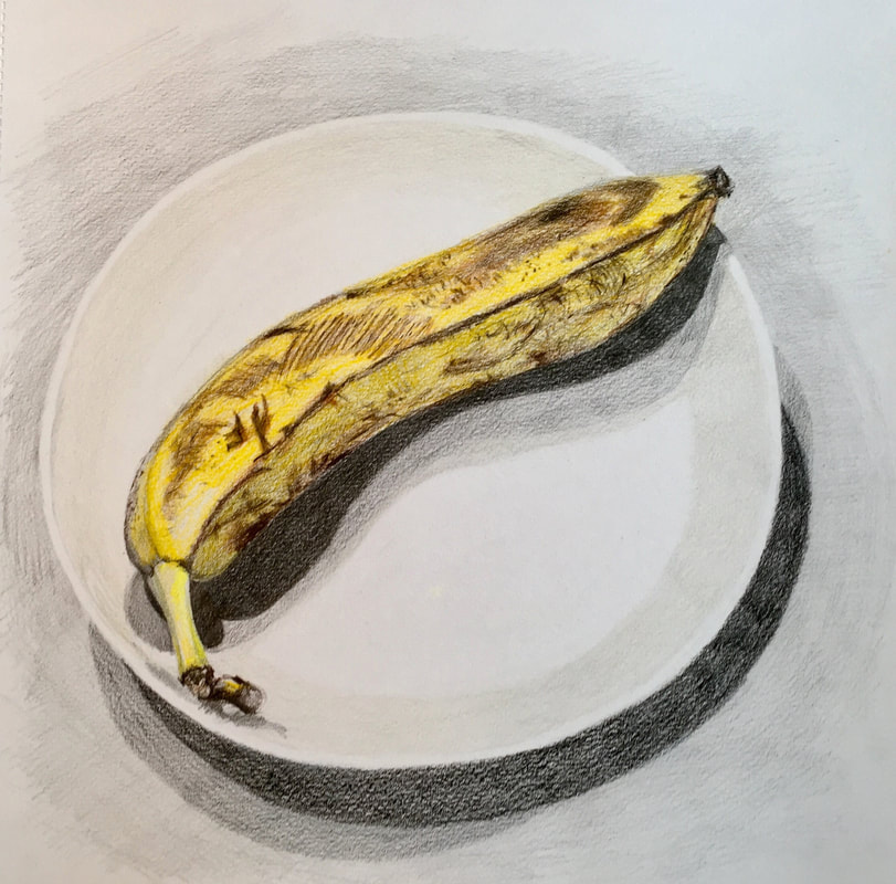
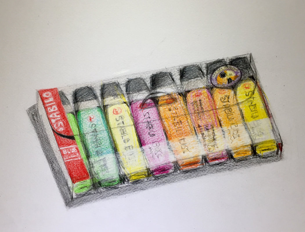
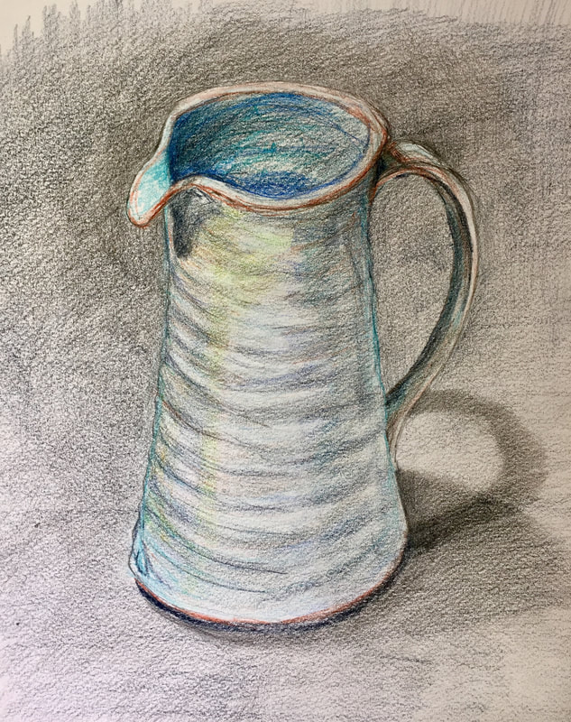
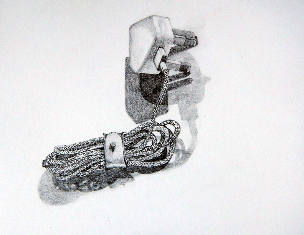
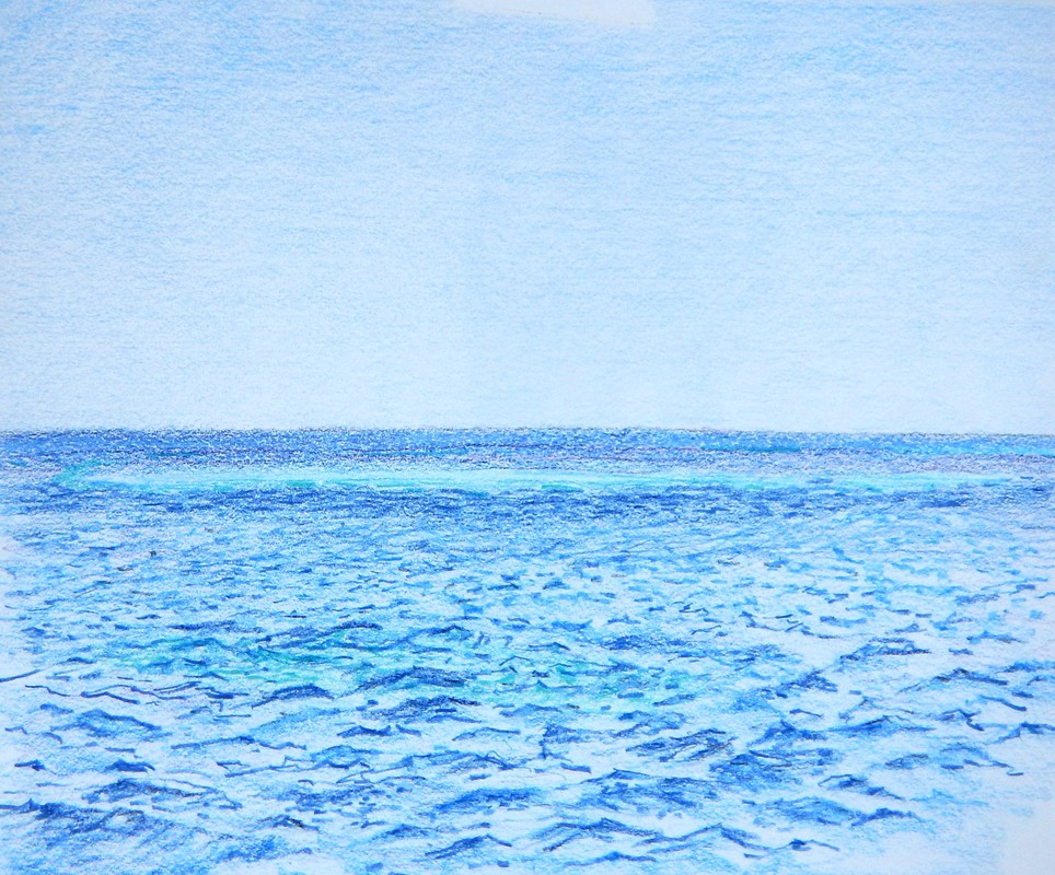
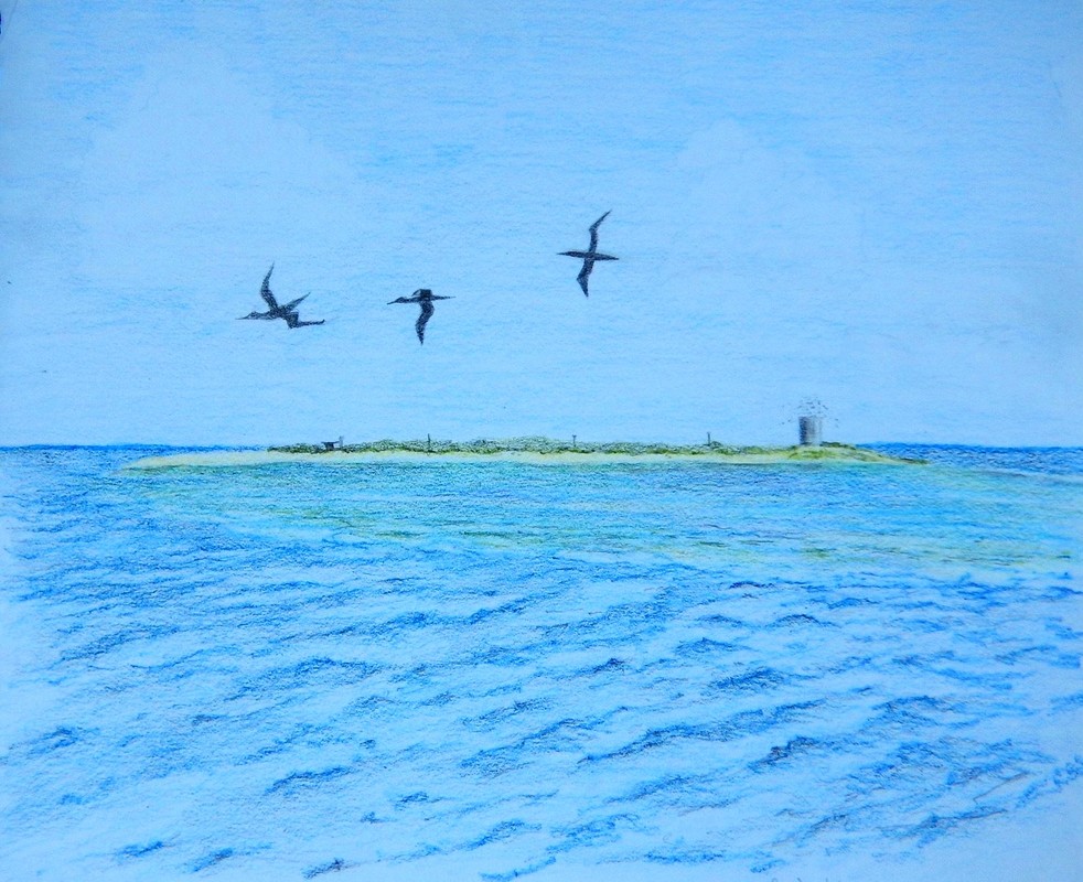
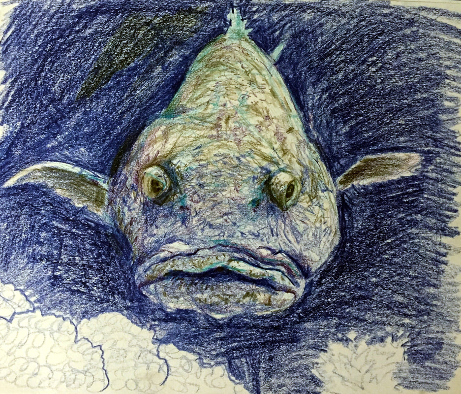
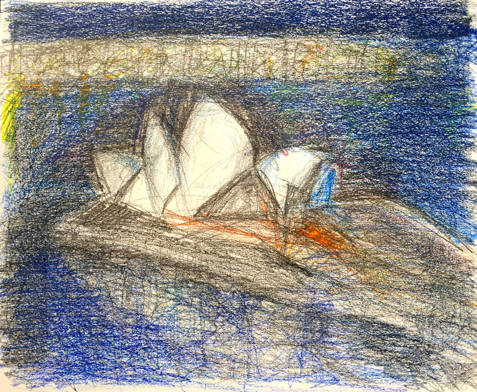
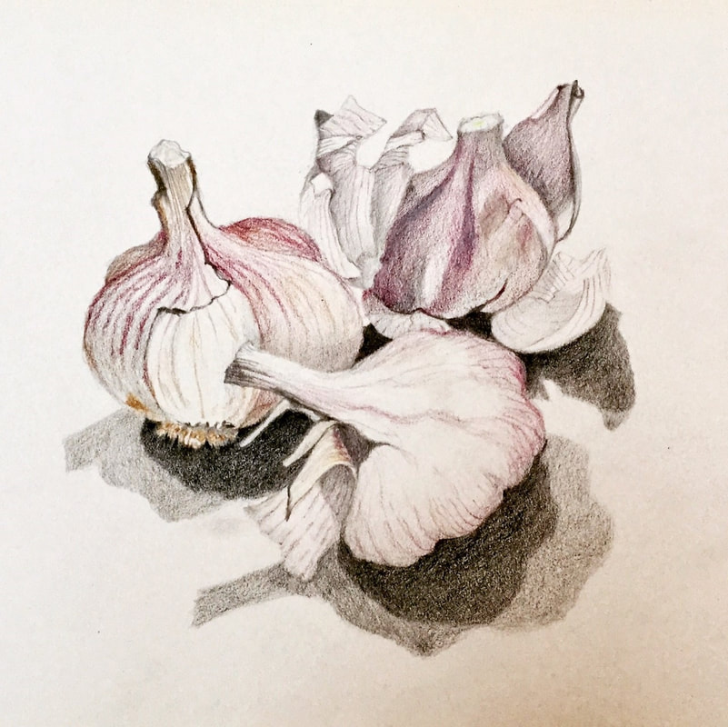
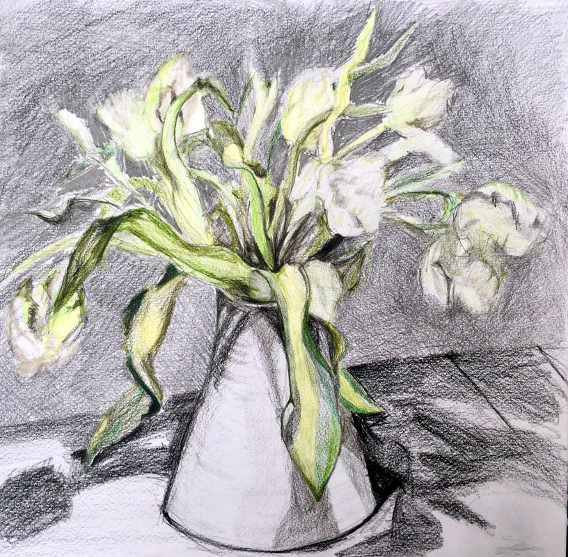
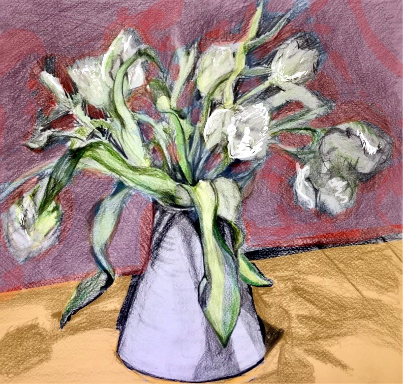
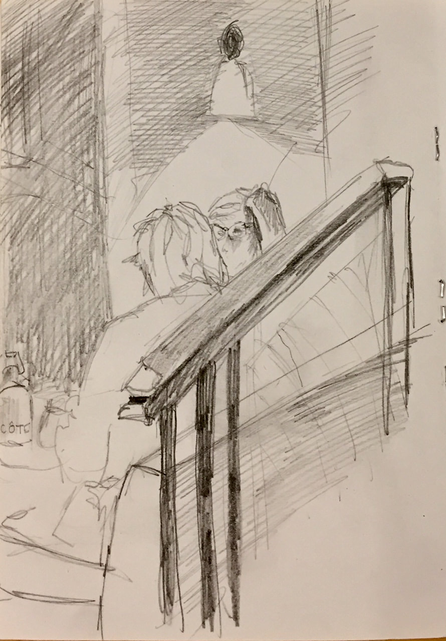
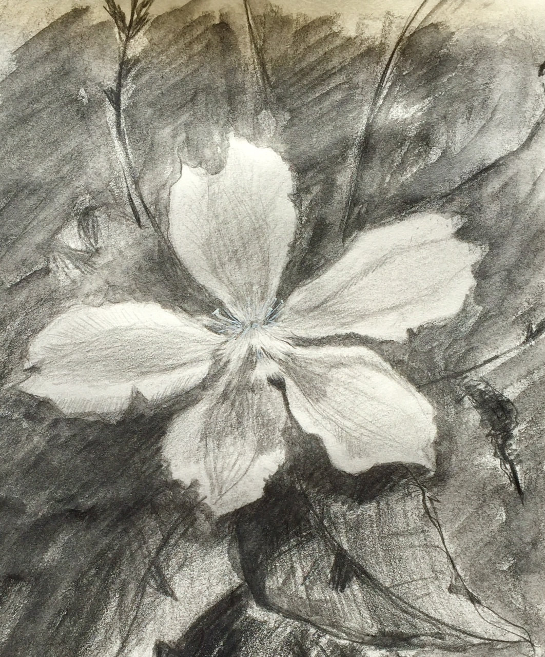
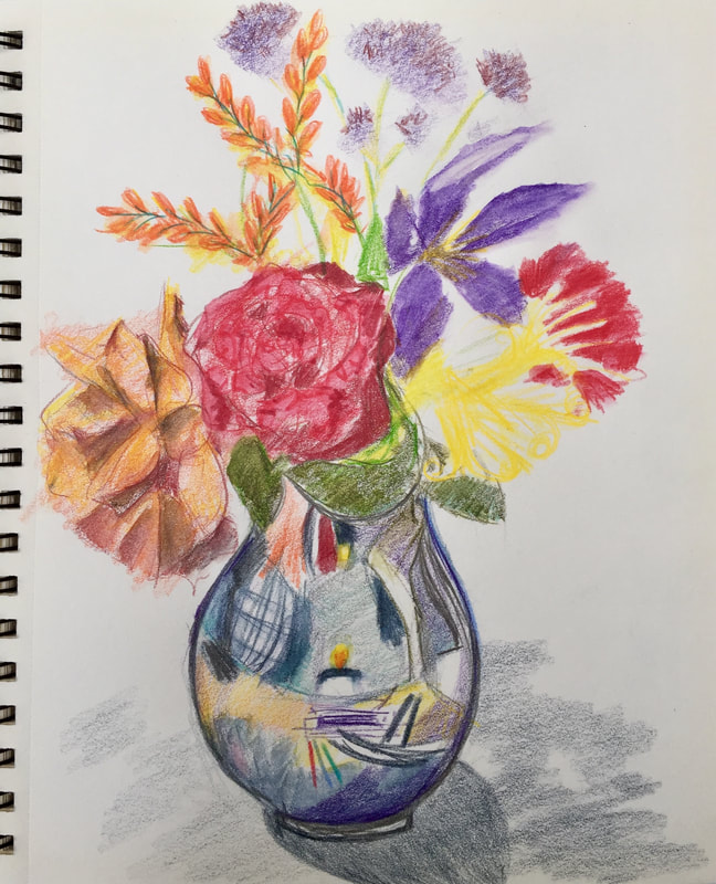
In August 2017 I set myself the discipline of doing a daily drawing or painting and have more or less managed to keep this up. You can also follow this regular project on Instagram. I used to use the Instagram address @MyDailyDrawingProject but this has now changed to:
@CarolineGriffithsArt
@CarolineGriffithsArt
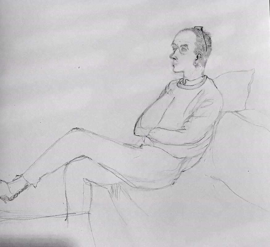
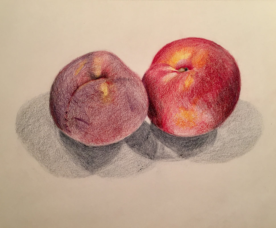
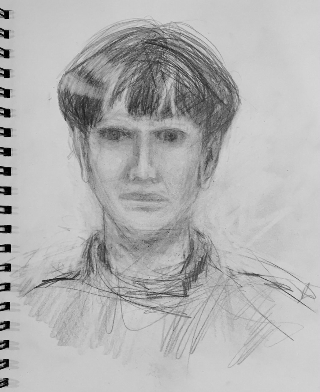
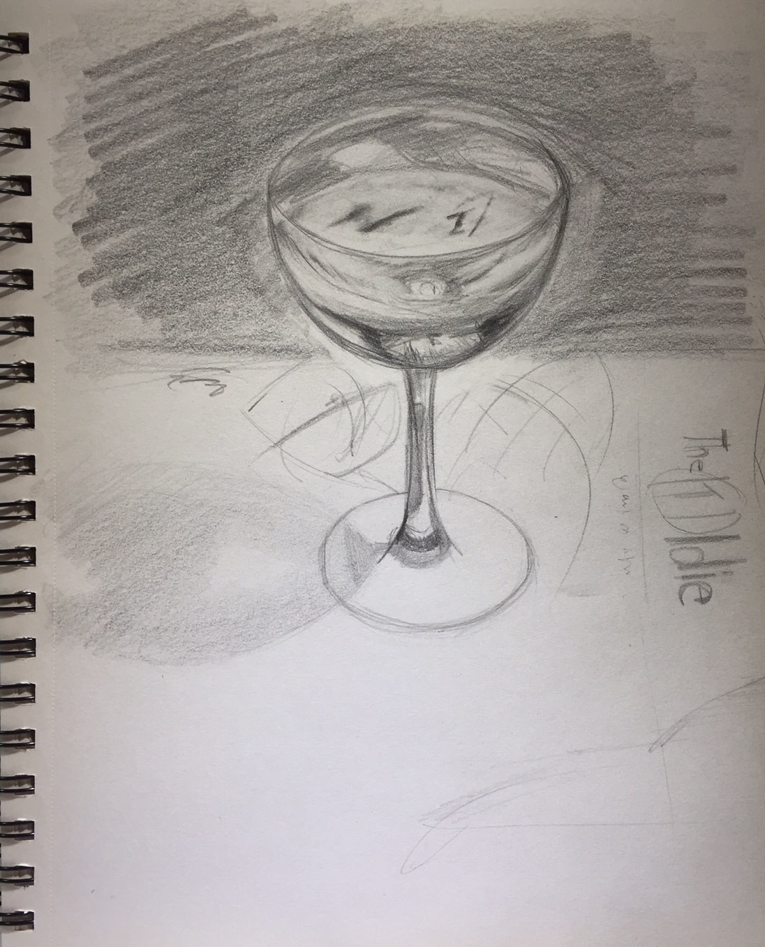
DECEMBER 2017

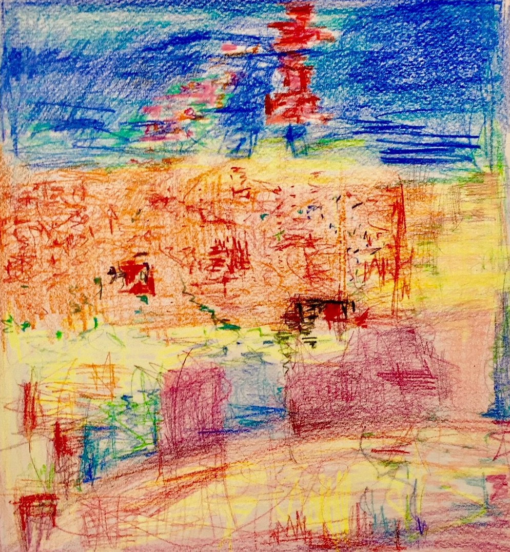


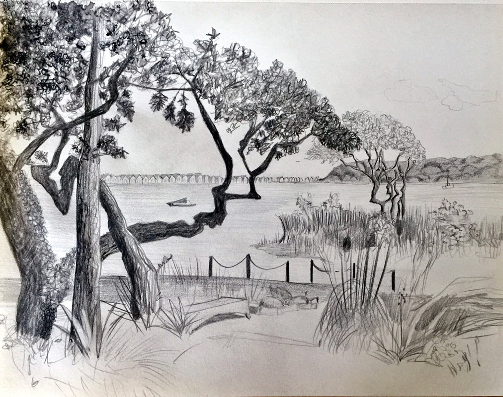
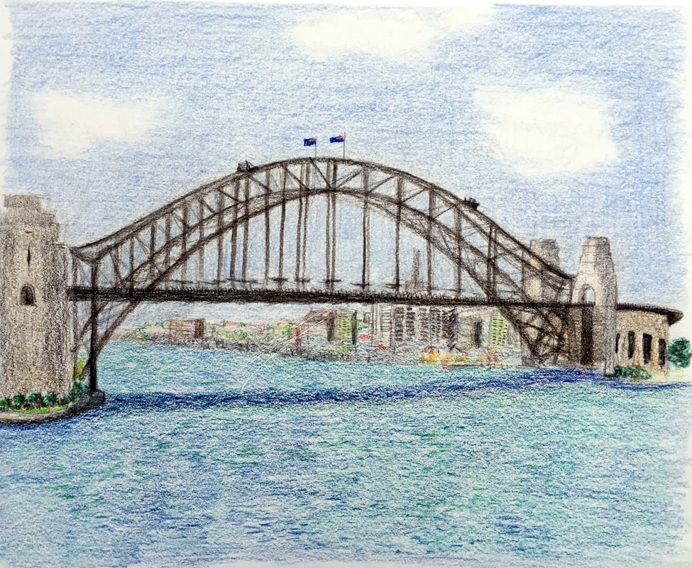
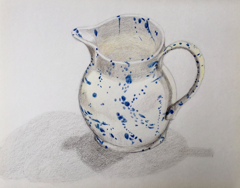
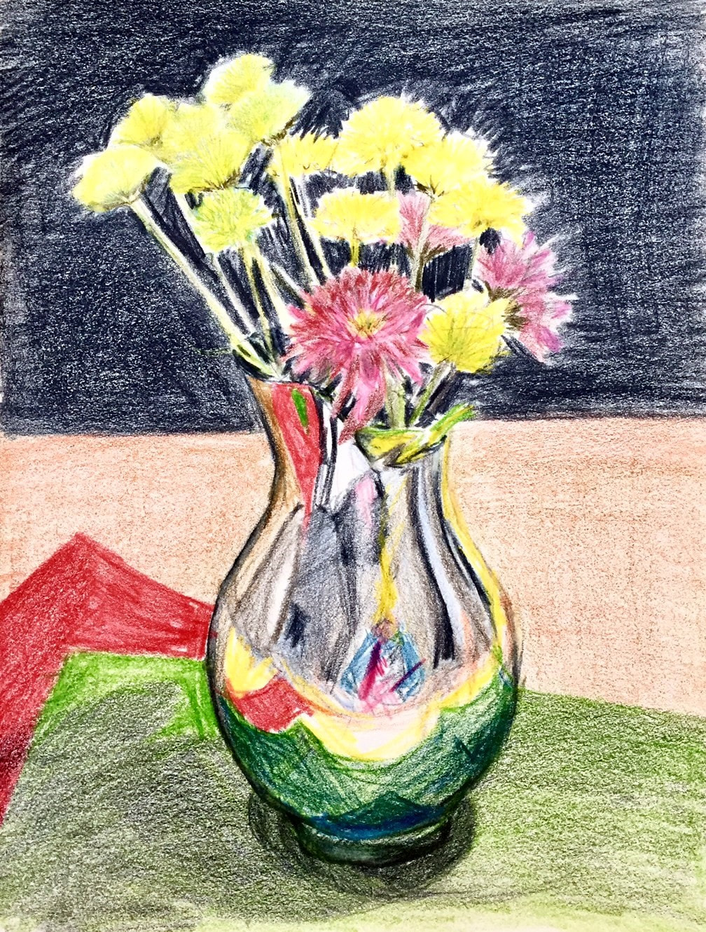
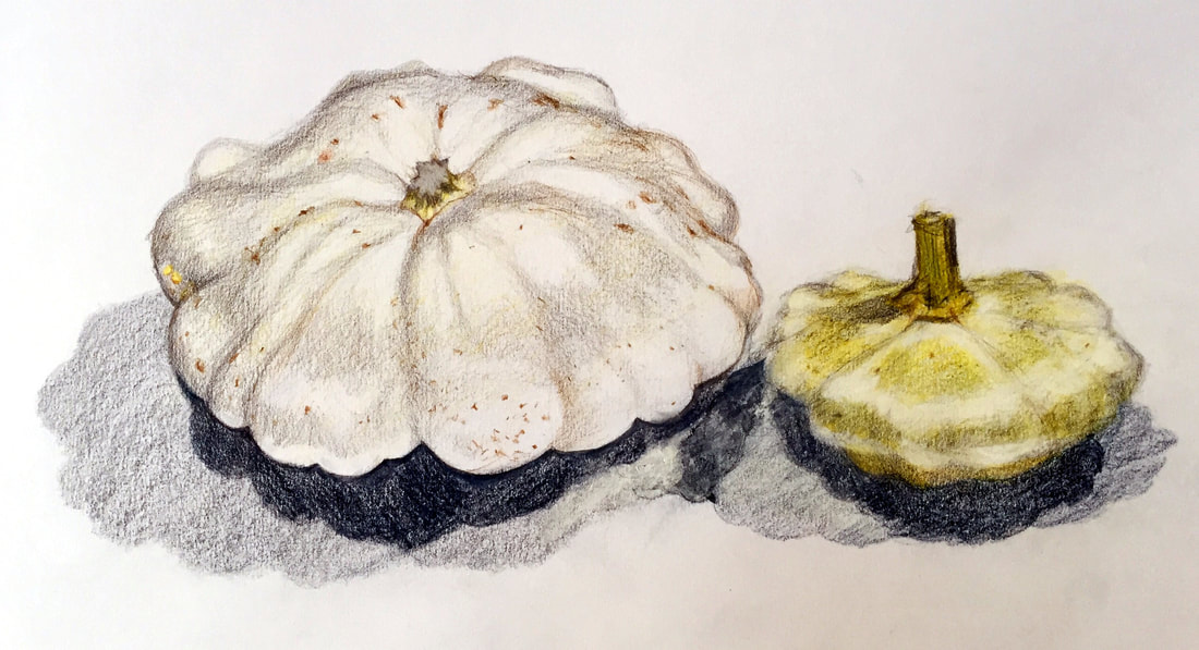
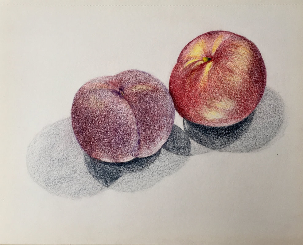
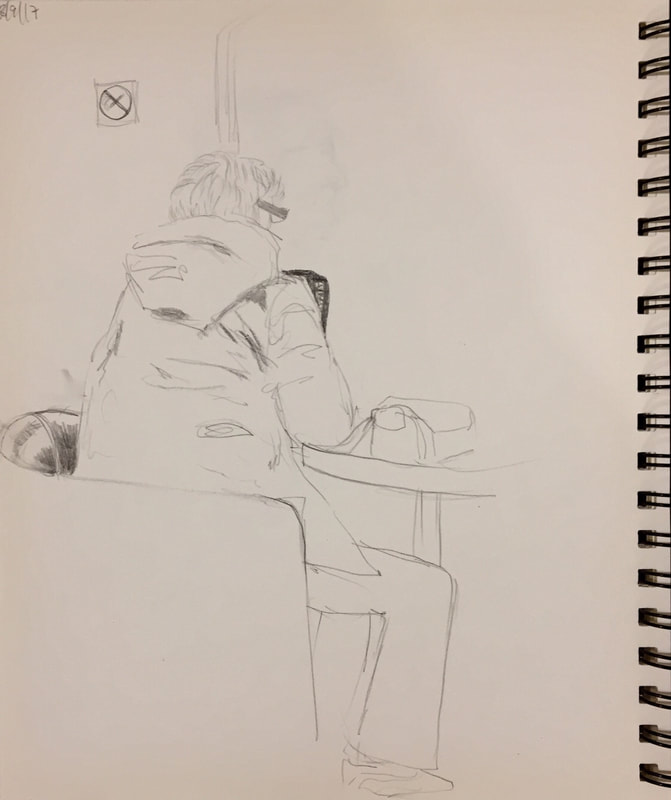
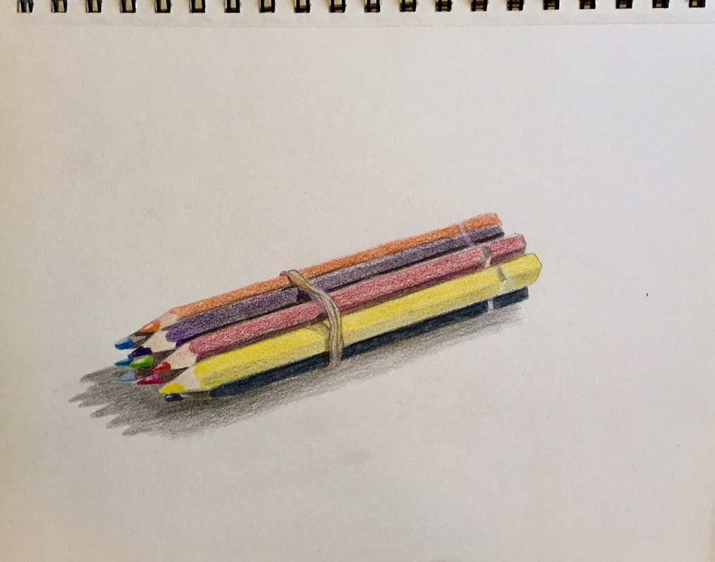
OCTOBER & NOVEMBER 2017

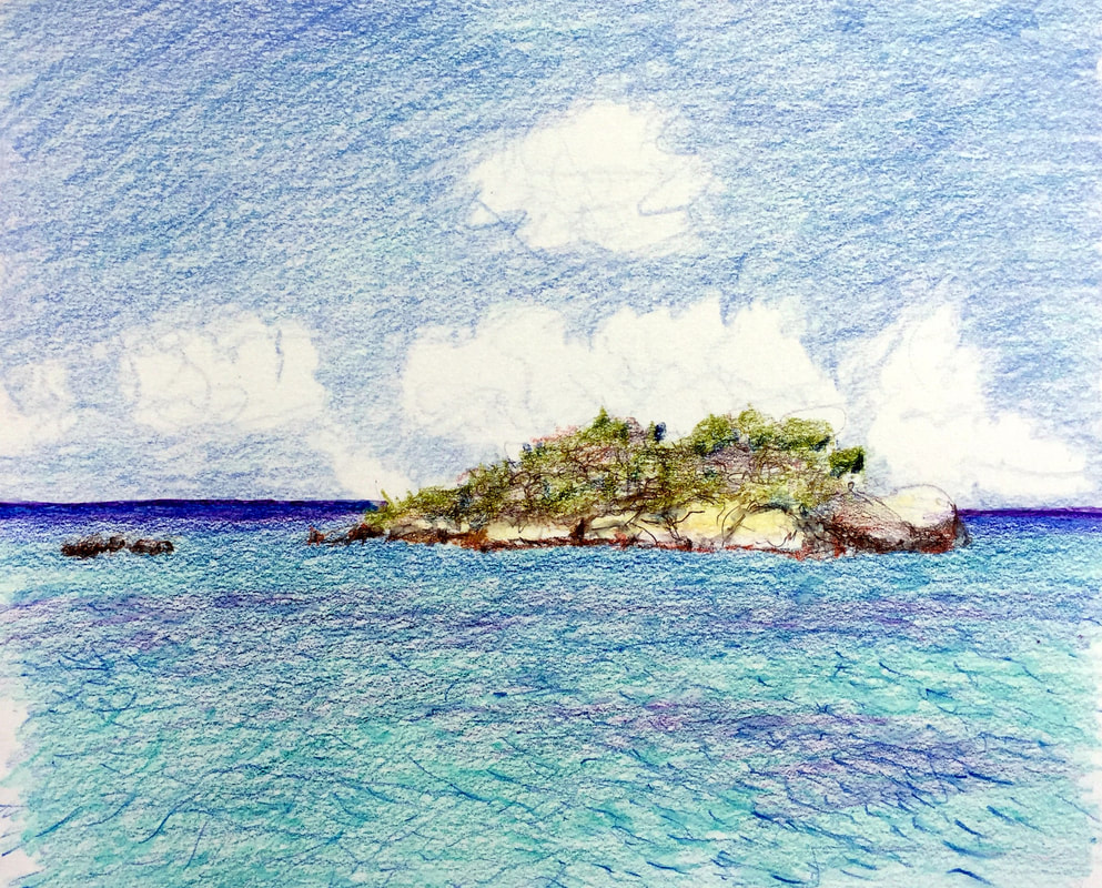


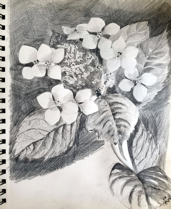
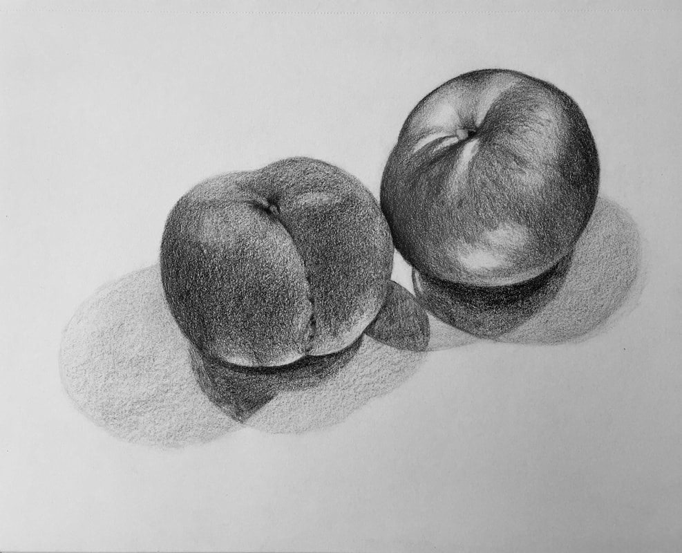
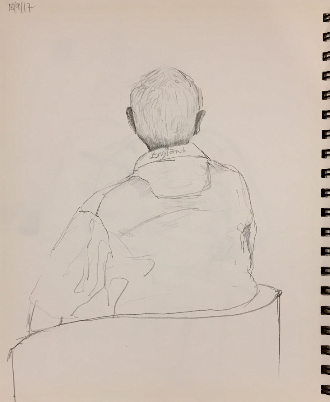
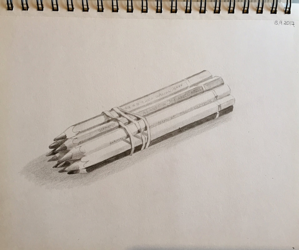
SEPTEMBER 2017

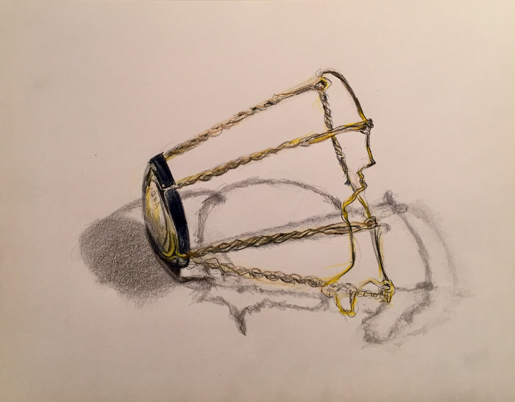
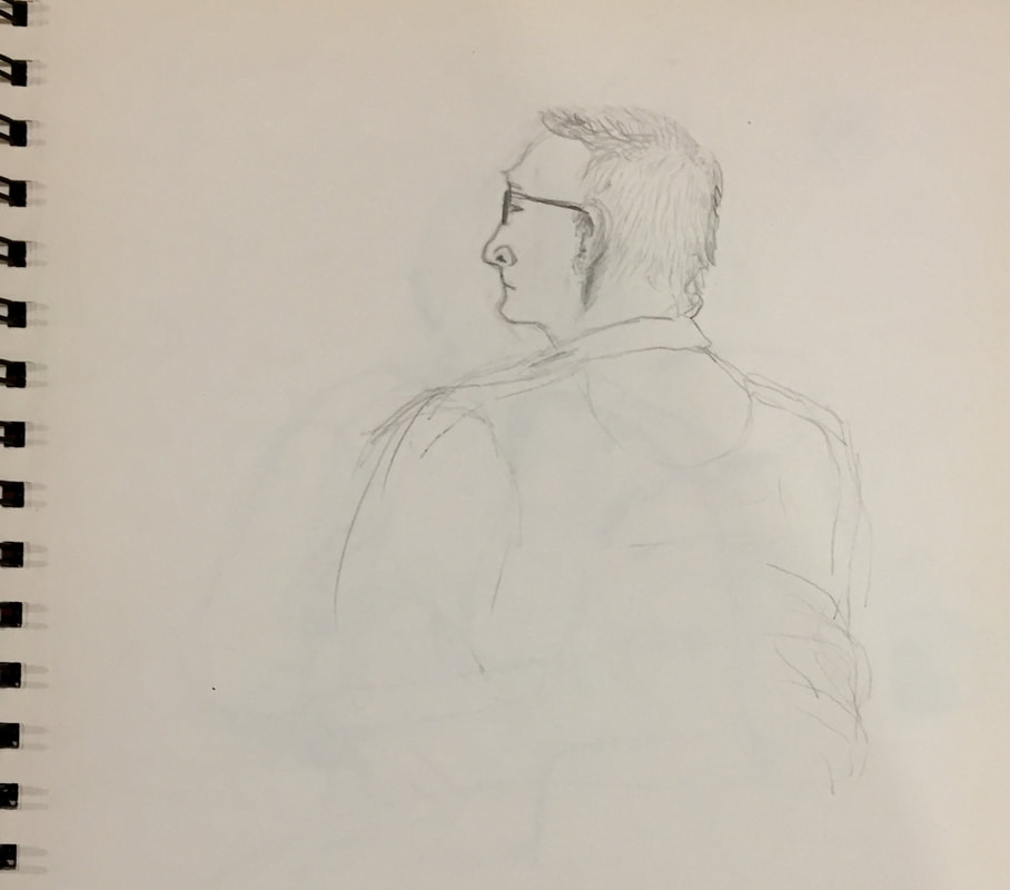
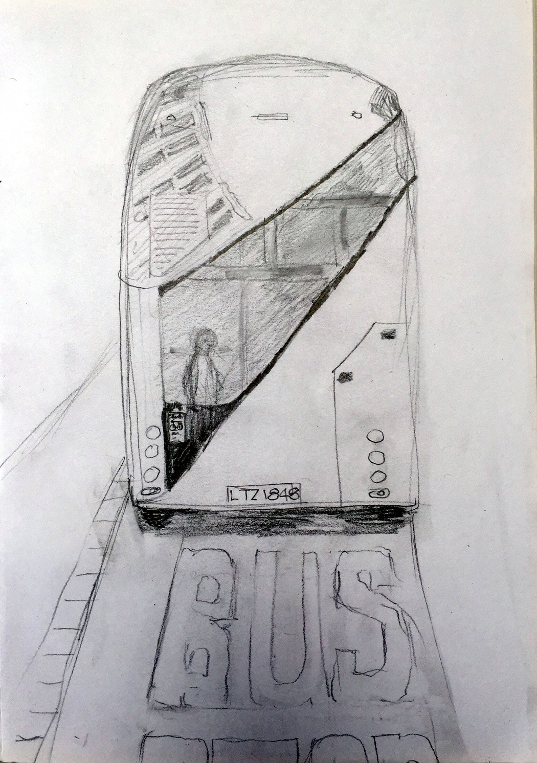


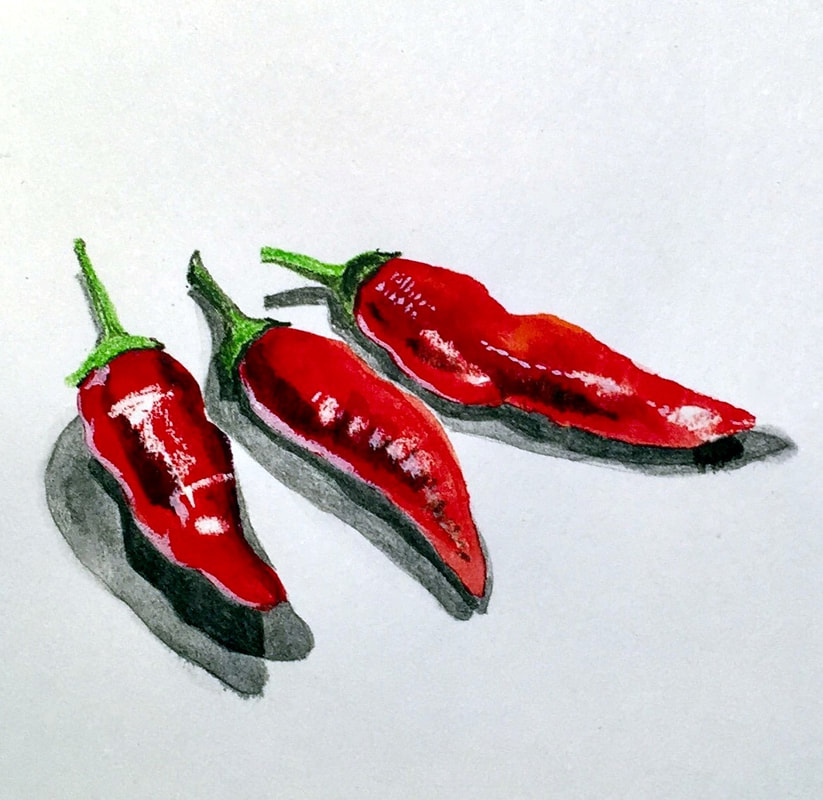
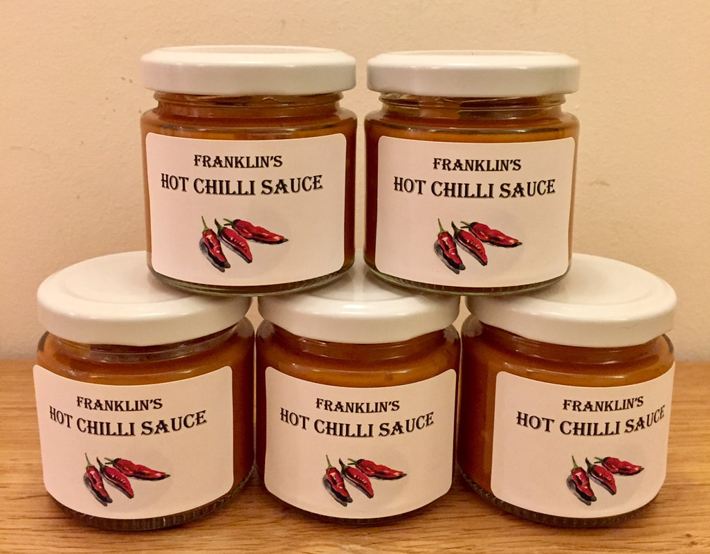
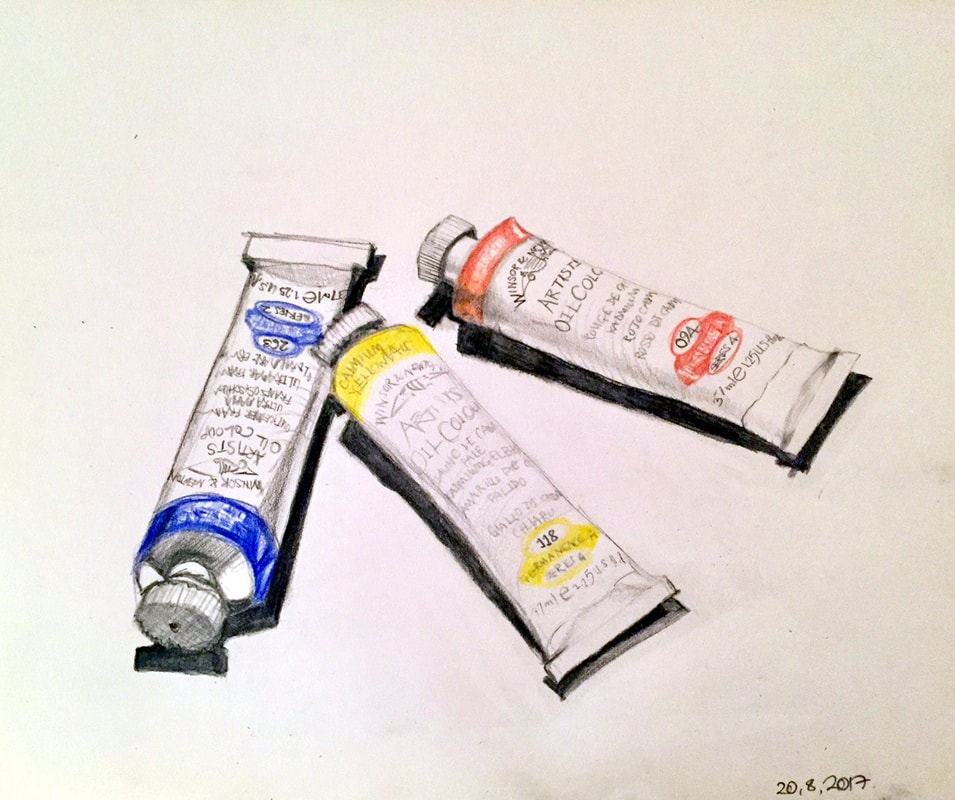
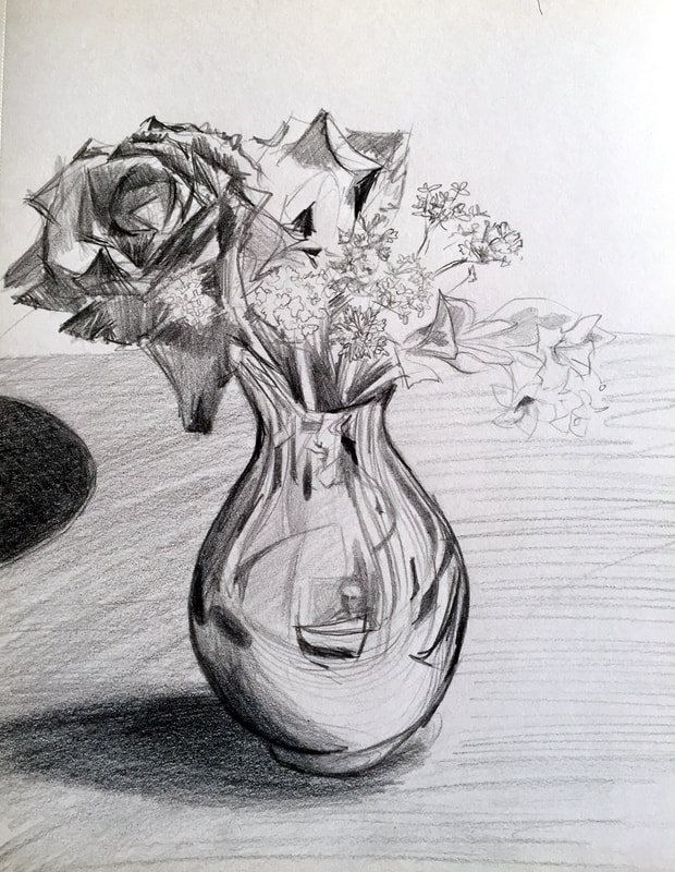
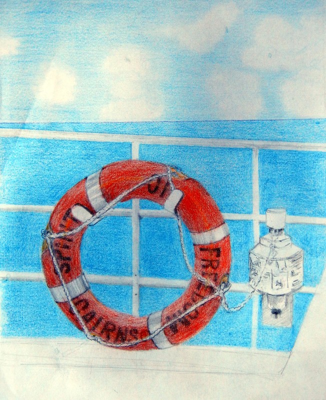
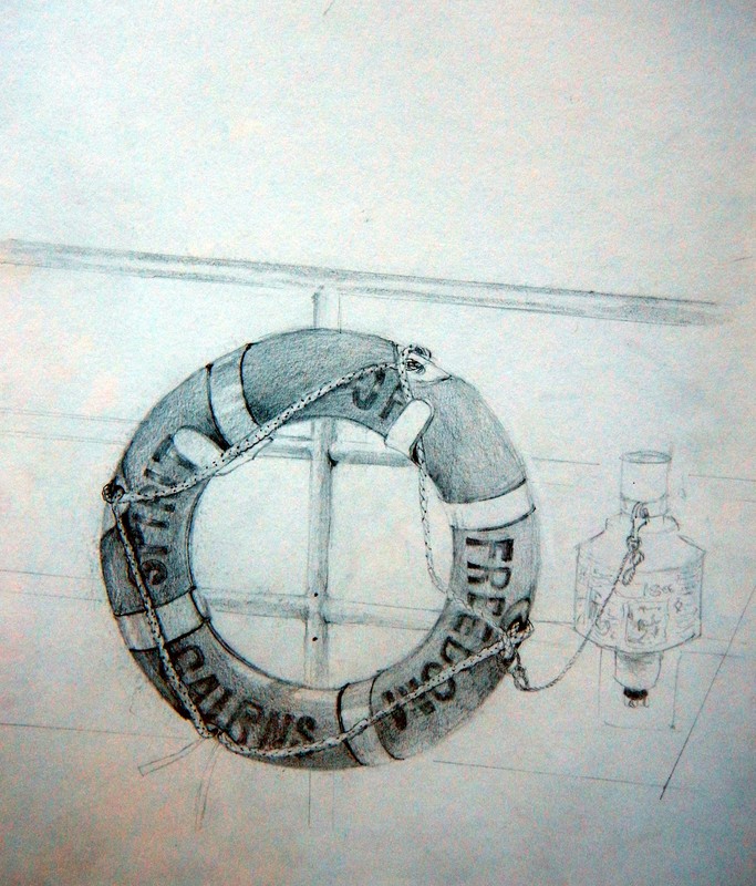
AUGUST 2017